Join us in designing for the Great Commission through solid DCPI branding.
We have developed a set of guidelines to aid you in the sacred task of utilizing our brand and assets, including our logo, typography, and inspirational references, for the higher purpose of designing for the Kingdom of Jesus. These tools are not just elements of style but symbols of faith that communicate our united mission.
Should you wish to employ our trademarks in a manner not outlined within these guidelines, we encourage you to reach out to us at [email protected] with a visual mock-up of your vision.
Together, we can ensure that every design serves as a beacon of His message and furthers the Great Commission.
Access our Brand Book in your own language. Please select from the options below:

Gospel-Driven Branding
Branding is a beacon of our identity and purpose. For us, it goes beyond mere aesthetics; it's about embodying the values and the message of the Gospel that we are committed to spreading. A cohesive and resonant brand ensures that our mission to train church planters resonates globally, creating an instantly recognizable symbol of hope and guidance.
It's not just about being seen—it's about being remembered and understood in the hearts of those we reach. In every color, typeface, and logo, we see an opportunity to reflect the life-changing message of Jesus' Kingdom, inviting all to come and see what God is doing through our fellowship.
Watch the Branding Session video featuring Evandro Sudre, Creative Director of DCPI, at the Global Vision Summit in Vista, CA.
A symbol of our commitment and vision.
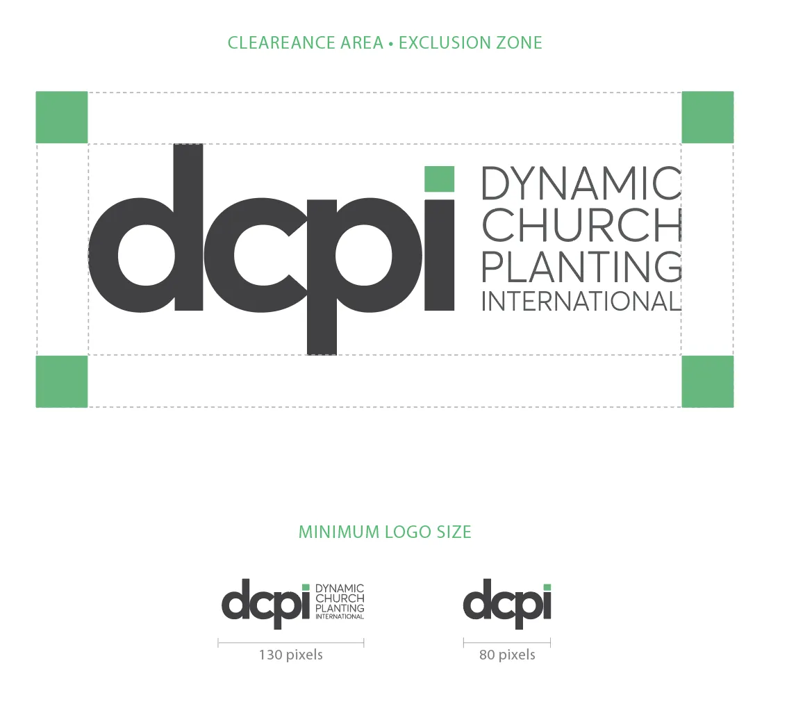
To ensure its integrity and impact, please maintain the minimum clearance area around the logo for visual clarity. It should stand out clearly in any medium.
Be vigilant that text or other design elements do not infringe upon this space. Additionally, observe the minimum size requirements at all times to preserve the logo’s legibility and prominence. This adherence to our standards is essential in presenting a unified image of our dedication to the Great Commission.”
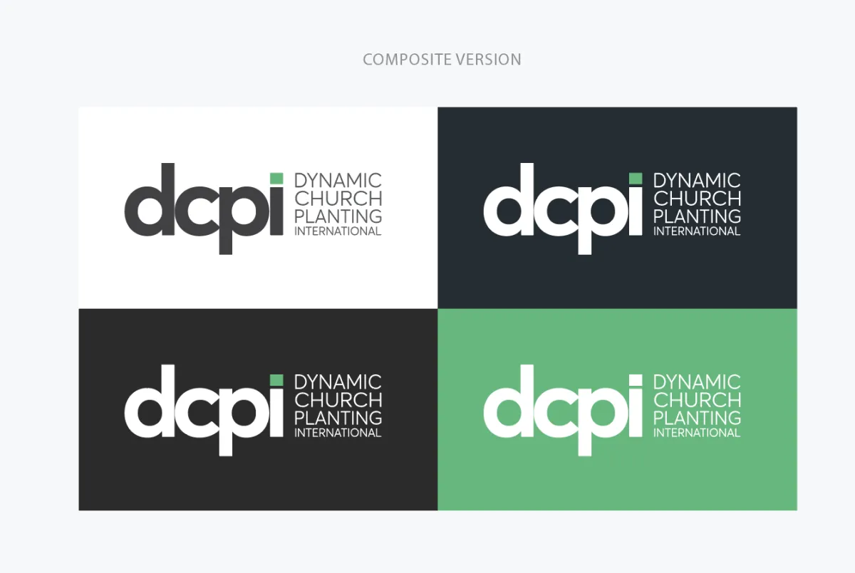
Most common logo applications
Always maintain the minimum clearance area around the logo to assure visual clarity and to provide maximum impact.
Make sure that text or other elements do not encroach the logo. And respect the minimum size all times.
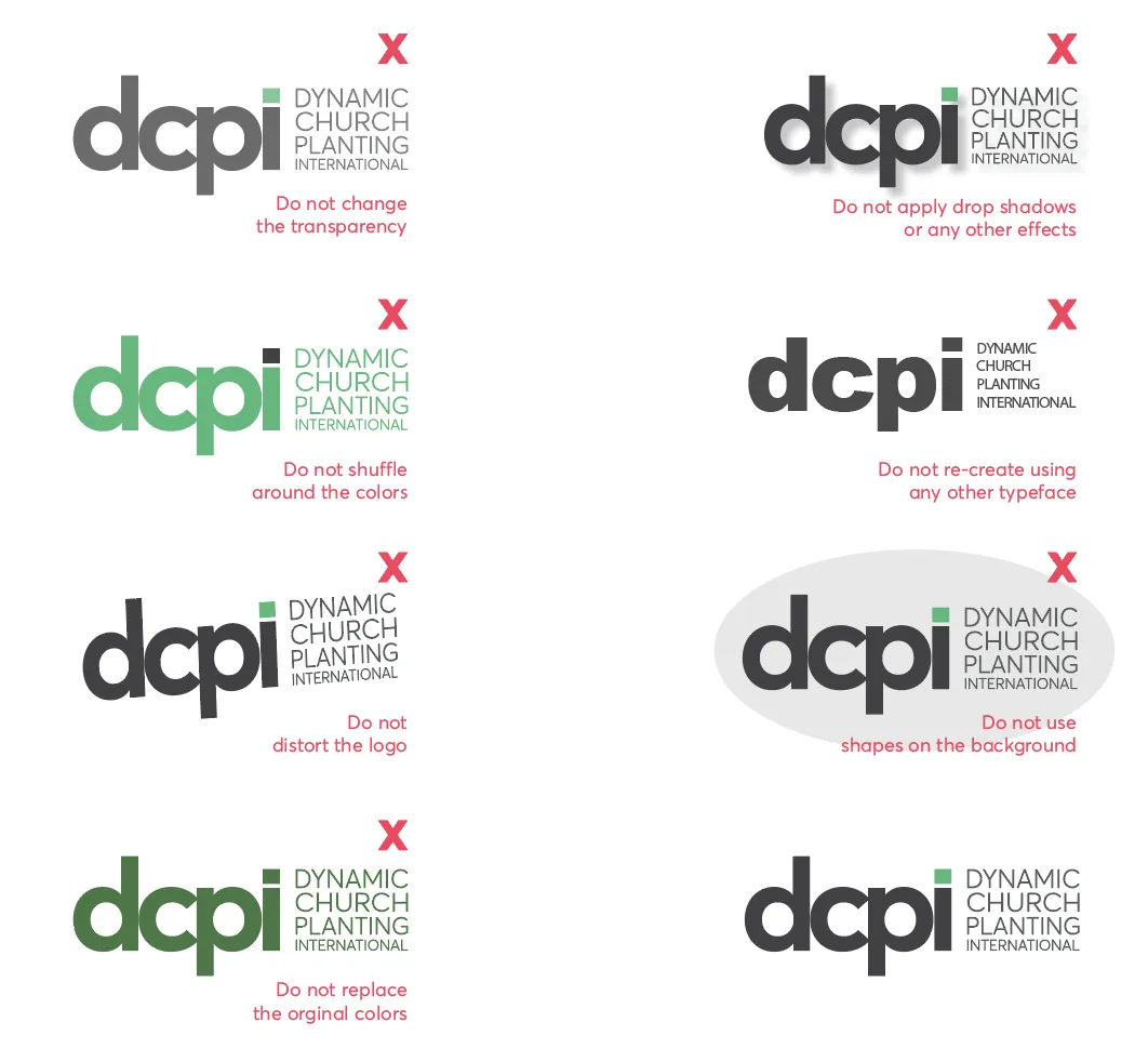
Logo misusage
Our brand is the result of meticulous design, with colors and proportions crafted for specific impact and meaning.
To preserve this intentional design, always utilize the official logo files provided. Refrain from recreating or altering the logo in any way. This ensures our brand’s integrity and recognition are consistently upheld across all platforms and representations.”
Meet our Core Colors
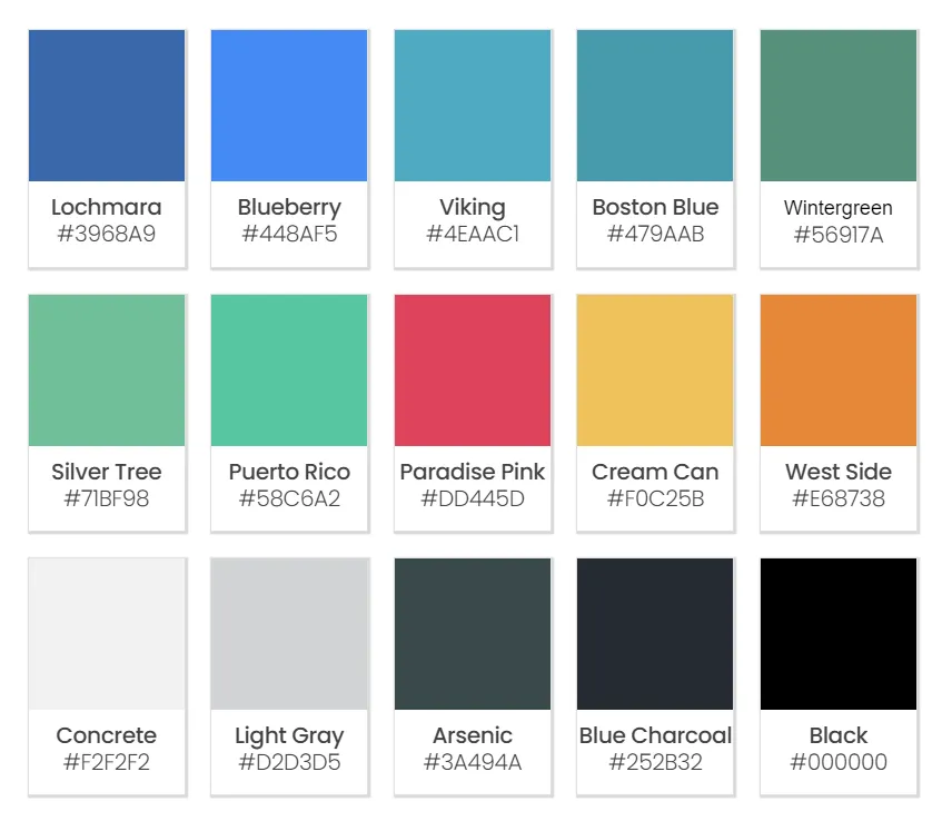
The cornerstone of our visual identity is Jade Green, a hue that reflects growth and vitality, synonymous with the life we find in Christ.
To accompany this primary color, we have a palette of supplementary colors carefully selected to create harmony and balance in your designs. Utilize these colors thoughtfully to craft compositions that resonate with our brand’s spirit and mission.
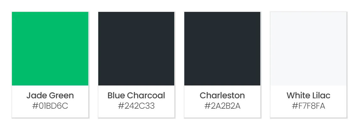
Complementary Colors Palette
In addition to our signature Jade Green, we present our complementary color range—each chosen for their visual harmony and symbolic richness. These colors are designed to accentuate and complement our main hue, bringing diversity yet unity to our designs.
They are not just aesthetic choices; they represent the multifaceted nature of our mission and the variety within the body of Christ. Use these colors to add depth, focus, and energy to your creations, always aligning with the message and values of our mission.
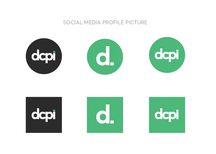
Social media display
We have a dedicated version of our logo exclusively for use as a profile picture on social media platforms. This specialized rendition ensures optimal visibility and brand recognition in the unique dimensions and contexts of social media interfaces.
Please reserve this version strictly for profile imagery on these platforms and refrain from using it in any other instance to maintain the consistency and integrity of our brand’s digital presence.
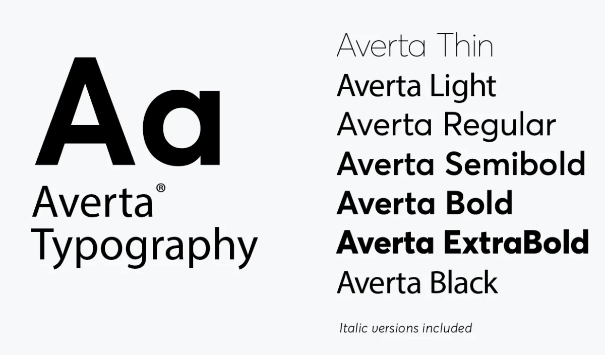
Typography for Printing
For keynotes and printed materials, our primary typographic choice is Averta, designed to ensure readability and elegance. When typesetting, apply optical kerning, maintain tracking at 0, and use sentence case to achieve the optimal typographic structure.
Print-specific fonts are optimized for the tactile feel of paper, with thin fonts offering a particular finesse in print form. However, they are not suitable for on-screen use, where different considerations are required for legibility. Adhering to these guidelines will ensure our printed communications reflect the excellence and intentionality of our mission.
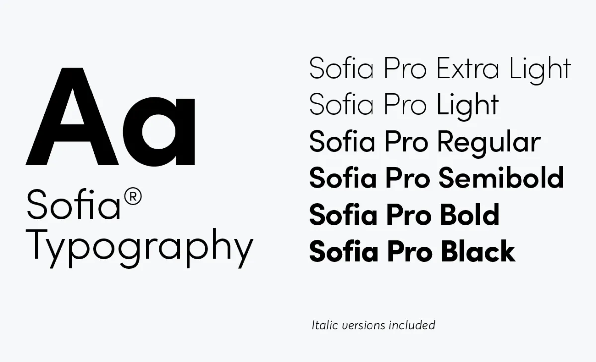
Are you a Adobe Creative Cloud® user?
When creating keynotes and printed materials within the Adobe Creative Cloud suite, we have a preferred selection of fonts that align with our brand’s aesthetic and values. Ensure you typeset these fonts with optical kerning, keep the tracking set to 0, and format the text in sentence case for consistency and clarity.
Remember, the fonts we’ve chosen for print are specifically tailored for paper viewing. Thin fonts have an exceptional printed appearance, exuding elegance and readability in physical form, but they may not translate well on digital screens. Please reserve these delicate typefaces for print only, to maintain their intended impact.
Web Font
This is our choice for keynotes and printed materials using Adobe Creative Cloud based fonts. Always typeset it with optical kerning, set the tracking to 0, and set in sentence case.
Print fonts are meant to be viewed on paper. Thin fonts, in particular, look wonderful in print but don’t work on a screen.
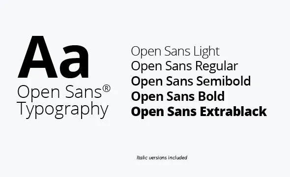
Type specimen:
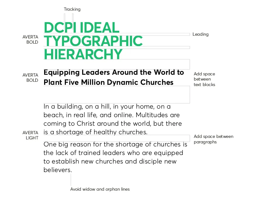
Ideal stack
A typographic hierarchy is an essential system in design that employs typography—through variations in size, font style, and arrangement of text—to establish a visual order, guiding users to different levels of information importance. This hierarchy acts as an organizational framework, helping to sort and present data in a way that is easily navigable and aesthetically pleasing, ensuring that viewers can effortlessly find the information they need.
This is how we compose titles and text stacks:
All Caps: Use all caps for titles that require immediate attention. This style is ideal for section headers, promotional calls to action, and when we need to convey authority and strength. Reserve it for contexts where brevity and impact are paramount.
Sentence Case: Use sentence case for a more informal and accessible tone. This style is perfect for article titles, subtitles, and any context that calls for a more human, conversational approach. This is the right choice when we aim to establish a closer connection with the reader.
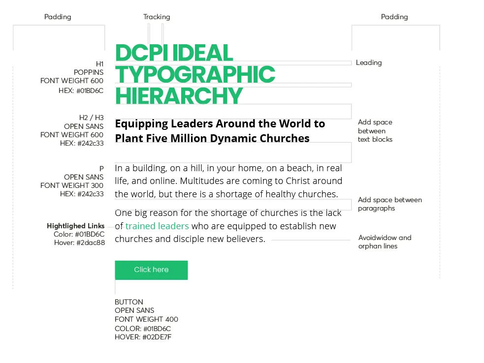
Webfont styleguide
Web fonts are crafted with the digital landscape in mind, optimized for on-screen viewing. They ensure that text is legible and clear across different devices and resolutions, providing a seamless reading experience for users. Employing web fonts in digital design is essential for maintaining readability and enhancing user engagement.
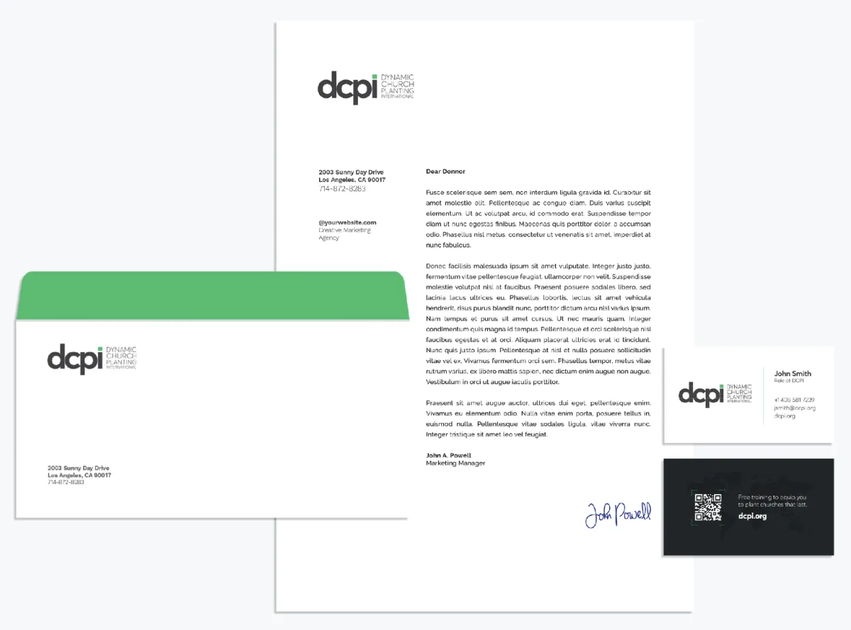
Standard Stationary
Mockup and Adobe Creative original files available.
Worldzone Signatures
Follow this signature template for our global zones. Please request the original file from our media team or download it directly from our media cloud. This ensures consistency in our communications across all regions and upholds the professional standard of our global brand identity.
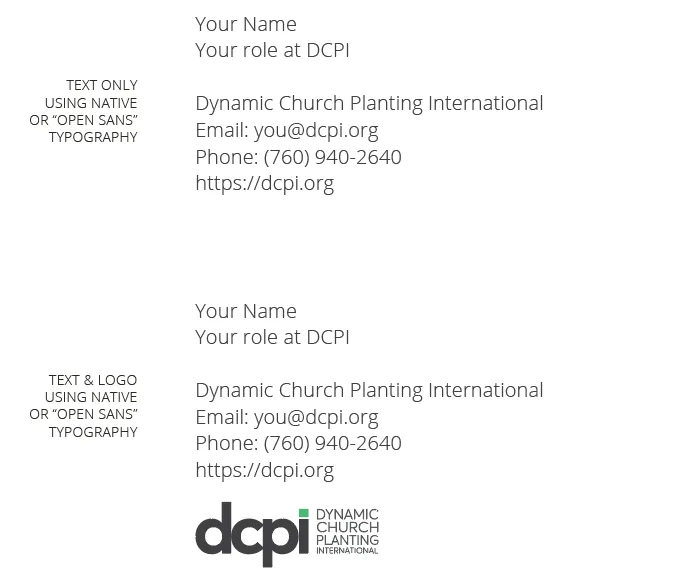
E-mail & letter signature
Keep it simple, including only essential information in three to six lines.
Use common fonts such as Helvetica, Calibri, or Arial, sized 12–14 points.
Use a single color, such as black or dark gray.
Inspirational imagery
For our publications we look for images that convey a sense of unity, multiculturalism and teamwork.

Shooting videos
The ideal framing is to leave the top of the head with a little slack, somewhere between 2 to 4 fingers apart. To do this, simply rotate the camera a few degrees downwards. This twist is very subtle, but it’s enough to make the image more balanced and visually correct.

Welcome to DCPI Media Cloud
Access and download the official DCPI logos and additional brand assets directly from our Public Drive. Simply double-click to open the folder, navigate to locate the specific files you require, and save them onto your computer for use in your projects.
We urge you to adhere strictly to the DCPI branding guidelines while using these assets. This ensures that our brand’s integrity and consistency are maintained across all media and platforms, upholding the standard of excellence we are known for in all our visual communications.
About DCPI
EIN Number: 33-0647375
News & Events
© 2026 Copyright Dynamic Church Planting International, All Rights Reserved.
Disclaimer
When you submit your information through a form on this website, your information will be stored in our secure database. By submitting your information, you are agreeing to allow us to communicate with you via email and SMS Texts. Additionally, if you have attended a DCPI training, your name will also be added to our secure database, and you will begin to receive email communications from DCPI. These emails include but are not limited to DCPI stories, training updates, prayer requests, general information about DCPI, links to make a donation, buy a DCPI logo product, learn more about our system of training, and other DCPI-related content. If you wish to stop receiving these emails and SMS Texts at any time you may unsubscribe, by emailing [email protected], and we will happily remove you from our email list.